Commercial Silk
Rebranding a Multi-Faceted Business & Website
Commercial Silk belongs to a family of businesses that specializes in acoustic solutions and elevates them through integrating artificial greenery to not only provide value in the performance of the materials and space, but also by cutting maintenance fees and ensuring code compliance for general contractors, interior designers, and architects.
As I also supported the marketing team with copy, designs, and social/email content, the research I was conducting that, strangely, these marketing terms were not really translating to actual conversions in terms of website visitors. Although the business points above are integral to sales and marketing, the actual user experience and heatmaps of visitors on the site was telling a different story: the visual aspect of the site was simply not engaging enough in a lot of pages.
CLIENT
Plantscape Inc. | Commercial Silk | CSI Creative
ROLE
UX/UI Design | UX Research | Brand Design
Information Architecture | User Journey Mapping | Competitor Analysis Design Systems & Component Libraries | Style Guides | Annotated Wireframes | High-fidelity Interactive Prototyping
METHODOLOGY
VISUAL UPDATE
Target Personas.
Not just more, but higher quality.
Initially, the biggest consideration for me was understanding the various personas involved in this particular business. As someone with relatively little experience in this industry going in, it was important to learn who I would be trying to reach, how their needs and goals differed, and how I could try to find a middle ground to appeal or alienate any of those groups.
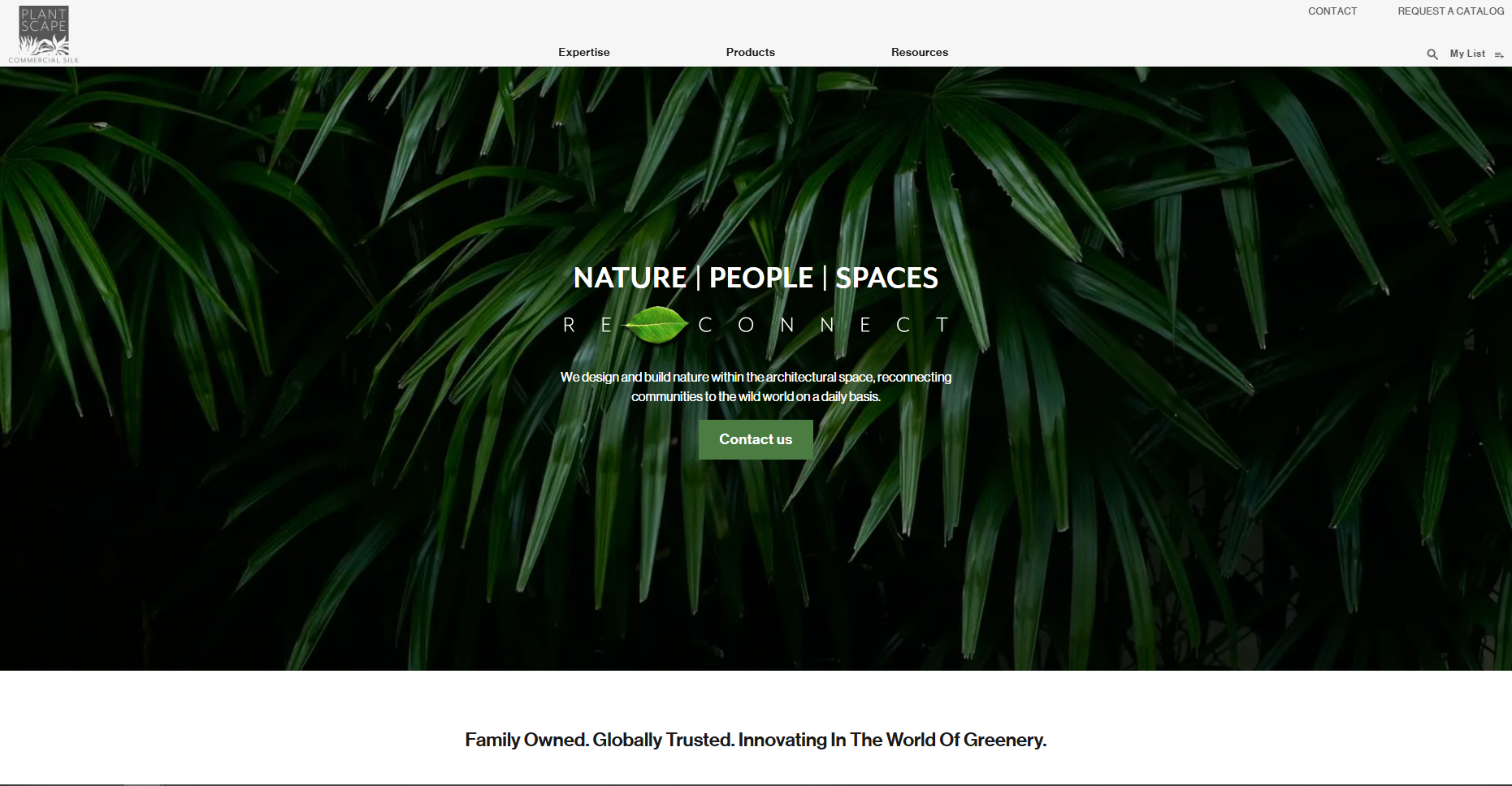
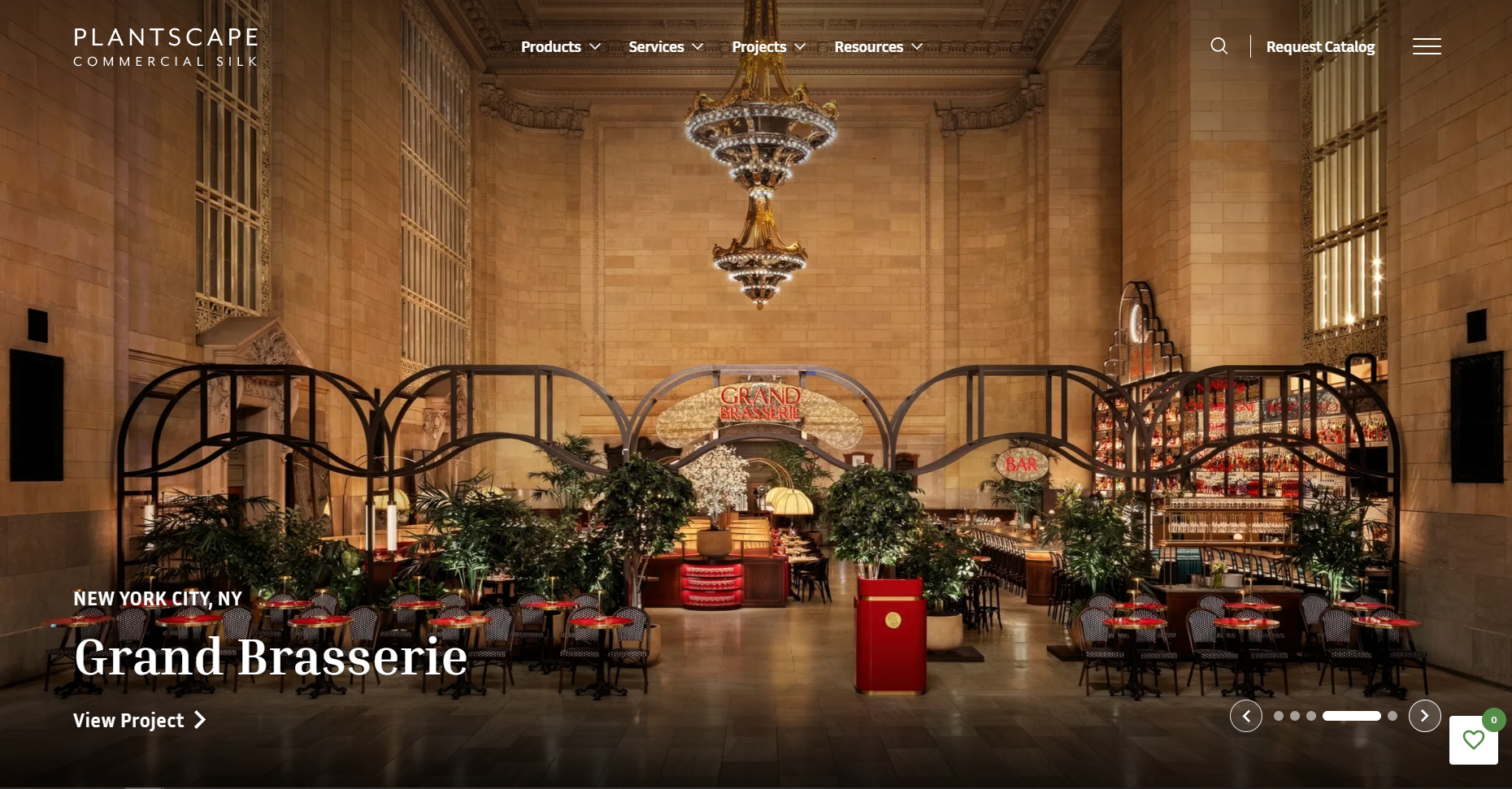
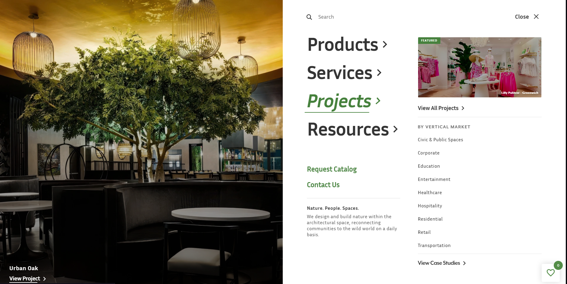
Oddly enough, despite my extensive research about personas, the industry, and the processes I was repeatedly coming to the same conclusion: there simply was not enough high quality and relevant imagery being featured on the website, and this was something people were specifically looking for. Considering Commercial Silk targets personas such as interior designers and architects its unsurprising that project photos were requested, but shockingly even the general contractors who I had been studying the personas for that were typically more concerned with the practicality and technical aspects were also frequently requesting those project photos in their feedback.
So the message was clear: more pictures and more examples of how exactly these products that are being specified actually translate into real projects and what types of applications people use them for.
BEFORE & AFTER
 Before
After
Before
After
 Before
After
Before
After
ONGOING
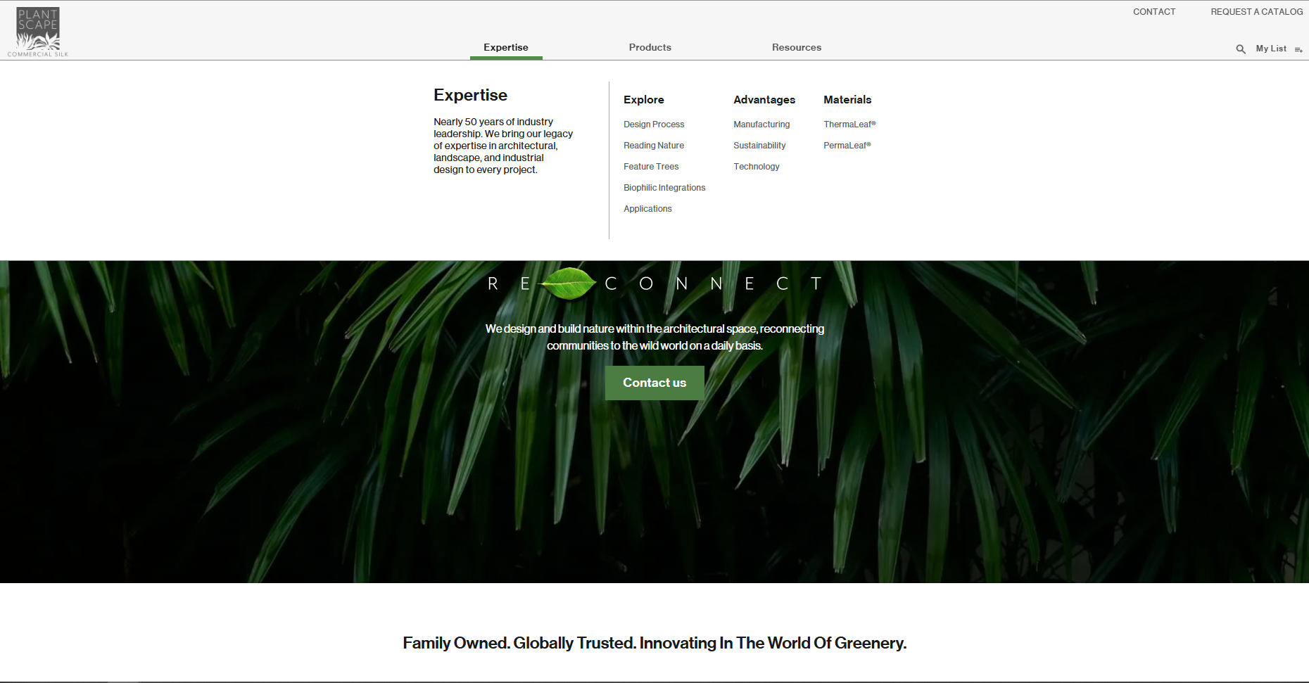
Clearer Information Architecture & Navigation Pathing
Photo Outreach Initiative
One major issue from the conception of this website originally is that it was created with the intent of providing SEO value, not as much for the user experience side of the business. The main goal was that by creating as many pages as possible, with as much SEO keywords and terms, the website would draw leads in and initiate conversations with sales reps. However, years later, this has somewhat left the site riddled with pages that don’t serve the purpose that they once did that need to be consolidated and clarified on what the intent is.
As mentioned, project and product photos are the main points of interest for this business. Regardless of whether it’s for social media, emails, or to give sales representatives more examples during meetings with leads, the need for high quality project photos has become increasingly apparent, which is why I have been working closely with the marketing team to outreach with past clients to acquire the rights to use professional project installations.